Why a Minimalist Brochure Design Works
In brochure design, there are many styles and preferences. Maximalist and minimalist designs are the two opposing poles when it comes to brochure design and brochure printing, and both have advocates and detractors. Let’s take a look at the minimalist brochure design and what it brings to the table.
Minimalism is all about simplicity and using fewer elements to focus the readers’ attention aka as “less is more.” Here are some of the reasons why less can achieve so much more.
Reader-Friendly
Being simple and plain to the eye, a minimalist brochure design is very reader-friendly. If your brochure needs to say something of significance such as a company advocacy, minimalism might better serve your cause. With fewer things to look at, a reader can easily make out the significant information from sheer design elements. With proper balance, a minimalist design can call attention to its message immediately. It’s a stylish, effective, straight-to-the-point approach.
DISCLAIMER: The following images are not owned by PrintPlace.com and are used for the sole purpose of inspiring our viewers.
With fewer things to look at, a reader can easily make out the significant information from sheer design elements. Click To Tweet
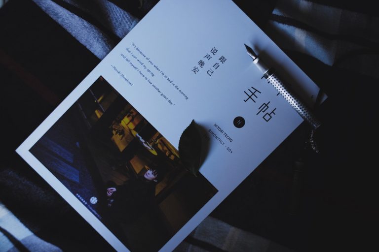
This two-color brochure design keeps it simple with typography and a few graphic elements.
Minimalism usually promotes the use of fewer colors and the appreciation for white or negative space (empty space without any printed elements). A color combination of white and green, along with the appropriate use of white space emphasizes particular text and a graphic element or two. These strategies show how minimalist brochure design works.
A Simpler, Cleaner Effect
White space is integral to minimalism. Living rooms, print ads, and websites designed through minimalist concepts are often perceived as cleaner and more spacious. Great minimalist design allows white space where it can accentuate, and in effect, support other elements of the design, which makes the bigger picture quite attractive.
Effective minimalist design is not just reader-friendly. All the white space also works with other design elements to bring about a cleaner and more attractive feel.

This feeling of a clean, uncluttered design void of unnecessary elements carries with it a refined undertone. This works great, especially for professional and advocacy-driven content.
A Minimalist Brochure Design is Faster to Finish
Having fewer elements, minimalist designs are normally easier to work on and easier to finish. There would be no constant tweaking of layer upon layer of images and backgrounds and texts.
More sophisticated minimalist designs entail a bit more time for conceptualization and subtracting elements until only the elements fundamental to the design remain. This still follows the main rule of minimalism, which keeps the overall elements only to what is necessary rather than having several elements work all at once.
Reader-friendliness, simplicity and cleanliness, and faster turnaround times – these are the main benefits of minimalism. At PrintPlace, you can create a brochure that employs all the elements and strategies of minimalism.
PrintPlace’s mission is to provide customers with unparalleled printing services through the knowledge and expertise of its employees.
Well nice work
I love minimalist brochure design. in fact all of my designs are minimalist including my resume design. I believe that if you can get rid of something unneeded, then just get rid of it.