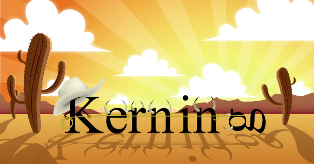
The basics of tracking and kerning – Tipster Friday
Do you know what “tracking” and “kerning” mean? If not, there’s no need to worry. Today’s “Tipster Friday” episode explains both, and yes there is a difference. Not everyone knows to check the tracking and kerning of their work, and it isn’t always necessary. Sometimes though, it can make a necessary difference in the layout. Ara explains why it is necessary, and when you are most likely to have a problem that needs fixing.
You will find Ara, her hipster glasses, and the announcer moose, all in today’s Tipster Friday video, so check out the latest episode here.
(Don’t miss the discussion in the comments about the best and worst fonts.)
Video Transcription
Hey everyone! Ara here for Tipster Friday, where I give you tips you’ve probably never heard of.
It’s been over a month since we last talked about typography, and I just can’t take it anymore! I’ve got the typographic itch and I have to scratch it!
“Tracking and Kerning”
Tracking and Kerning are like a good pair of suspenders, overlooked and underrated. Let’s start with some definitions.
Tracking and kerning refer to the amount of space between characters. Specifically, tracking adjusts the spacing between all the characters over a range of text.
Kerning adjusts the spacing between specific pairs of letters.
Most of the time, design programs kern pretty well automatically. If fact, you’ll almost never have to worry about adjusting kerning in a body of text. The spacing between letters is too small to notice subtle changes. Headlines however are a different story. When the size of text increases, so does the white space, which makes odd spacing more obvious.
Most kerning problems come from uncommon pairs of letters. Imagine you’re designing a logo for the local radio station, KZRA. These letters are almost never found together so the default tracking might look a bit off. You’ll need to adjust the kerning between letters to achieve a balanced look.
Free fonts often have kerning problems. For example, Chevalier Stripes is a super cool font but the default tracking runs certain letters together. To fix this, begin by finding what’s called the “key pair.” This is the pair of characters that needs the most help. Adjust the kerning for these letters, and then kern the rest to match. Bam! Look at that fine kerning.
When it’s all said and done, kerning is about balance. Yin and yang. Kerning is the Zen of typography, and unfortunately, there’s no exact science to it. Use your best judgment. If it looks good, it probably is.
That’s all for this week. Are you guys typophiles like me? What is your favorite go-to font? Tell me in the comments. See you next week!
PrintPlace’s mission is to provide customers with unparalleled printing services through the knowledge and expertise of its employees.