How to make a French fold
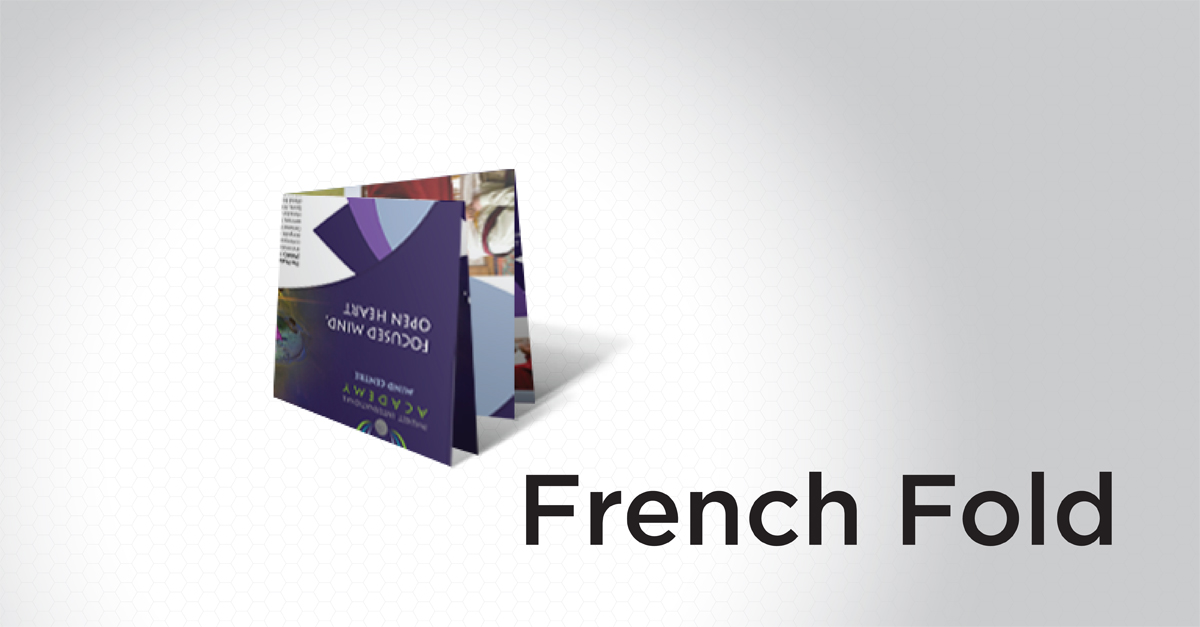
A French fold is the combination of a half-fold in one direction followed by a half-fold perpendicular to the first. This results in eight panels.
How-to guides and tips to make your PrintPlace.com experience even better.
A French fold is the combination of a half-fold in one direction followed by a half-fold perpendicular to the first. This results in eight panels.
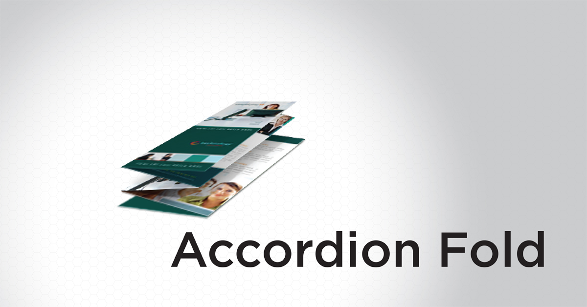
An accordion fold is created by folding a sheet of paper back and forth with three folds. It is similar to a Z-fold but has one more fold.

A roll fold, or barrel fold, is created by folding one section of paper inward, then continuing to roll and fold in the same direction.
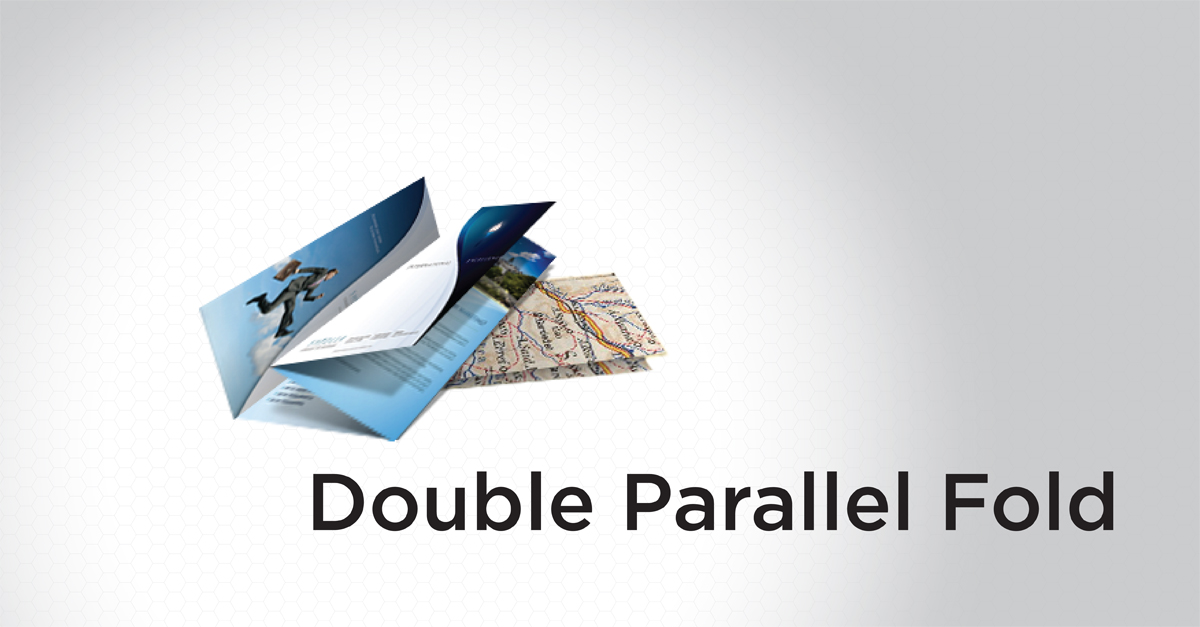
To make a double parallel fold, paper is folded in half and then in half again in the same direction.
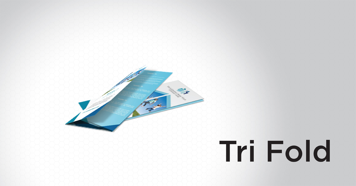
A tri-fold is made by folding both sides of a paper in toward the middle to create three equal sections.
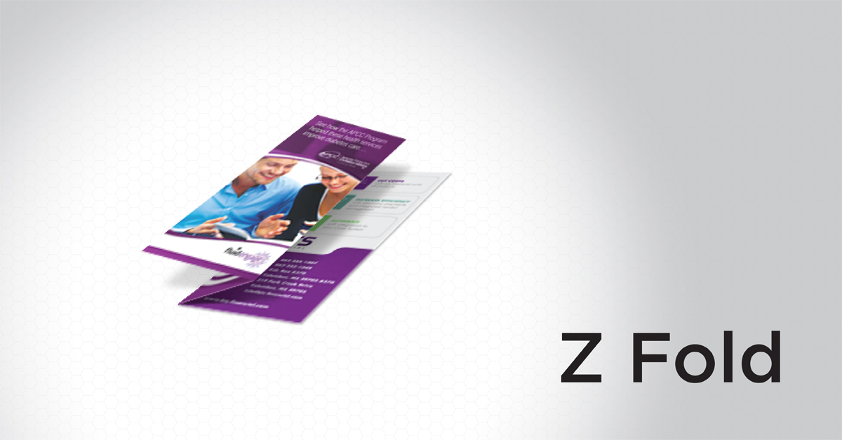
A Z-fold is made by folding a piece of paper into thirds, with one third folded forward and another folded backward.
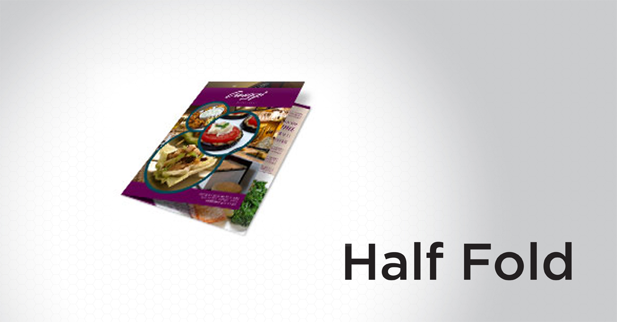
A half-fold is the simplest fold. It is created by folding a piece of paper in half, resulting in four panels of equal size.
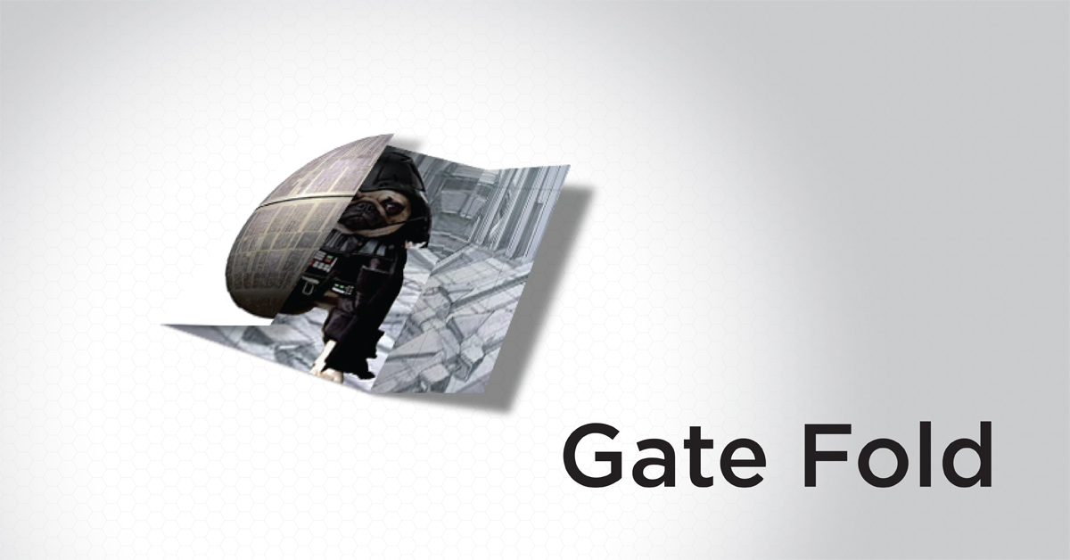
A gate fold is created by folding two ends to meet in the middle. This creates a large section in the center and two smaller ones on the sides.
Here are the best tips to keep in mind while creating your artwork and saving your file.
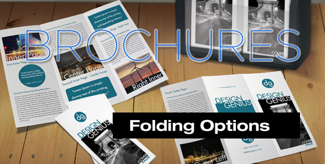
The half-fold and tri-fold are pretty simple and easy to figure out, but with names like double parallel fold and French fold, they can be a bit harder to remember. No problem. That’s why I am writing this post.