Creating moods with fonts: Graphic Design Friday
It’s time for another graphic design tip, or should I say… ggggrrrAAAPHIC DESIGN TIP! Could you tell what kind of mood I was in there? I was going for dramatic.
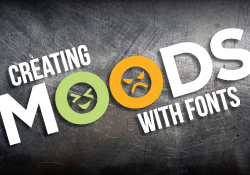
This week our quick tip video is about creating moods with fonts. While designing business cards or any piece for printing, it is important to keep in mind what your font choice portrays about your company.
The new PrintPlace.com video shows you what different fonts imply and how to make them say what you want.
Video Transcription
Welcome back for another quick graphic design tip from PrintPlace.com.
We’ve been talking a lot about typography, and the importance of font choice, and what it says about your brand. This feeling that a font evokes is called mood. Typefaces can have many moods. Fonts can be modern, classic, casual, serious, and even dramatic.
When choosing a font, consider the feelings you want your audience to have about your brand. For example, a furniture store might want to portray a classic look and feel. An art gallery might prefer a clean and modern image, or a florist might want something rustic and natural.
Combing fonts can also create moods. Take a modern typeface like Gotham Light and combine it with a classic like Chevalier, and you get a mood that is something else altogether.
Color affects the mood of typefaces as well. Take our florist card for example. The cool green supports the natural rustic mood of the card. Change the color and the design has a very different feel.
That’s it for this week. Come back next week where we’ll talk more about fonts and tips for combining them. Don’t forget to subscribe!
PrintPlace’s mission is to provide customers with unparalleled printing services through the knowledge and expertise of its employees.