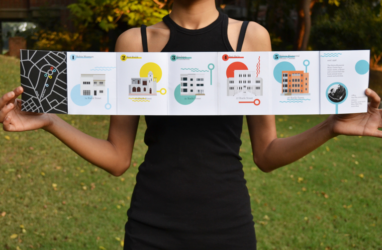
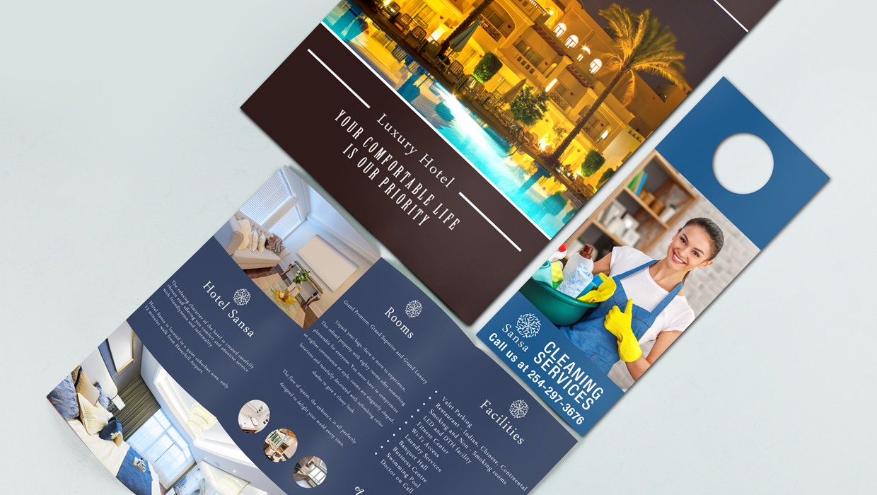
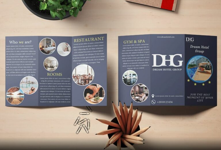
Filed under: Uncategorized | Tags: brochures, catalogs, design tips, marketing advise, printing design, Thanksgiving Marketing
Stand out from the competition this year with your Thanksgiving marketing. Everyone seems to stick with the same icons and ideas for Thanksgiving, such as the turkey. Break away, but not too far away, from traditional Thanksgiving graphic design with the tips below, and you’ll be sure to capture the attention of consumers.
Family
Thanksgiving dinner is a common theme for marketing during this time of year, but rather than using a photograph of a family at the dinner table with a large turkey in the center, try a different approach. For a funny tone, use a picture of Uncle Ed snoring on the sofa with his mouth wide open. Or for advertising for a restaurant, use a picture of Mom dropping the turkey on the kitchen floor with a subtitle mentioning your delicious turkey dinner available for just such an emergency.
Pilgrims
Incorporate the Pilgrim story and legends into your promotional materials for touching on the heart of the holiday. You may want to include the first Thanksgiving story into your brochures or catalogs to entice readers to open the cover. Or you may want to use images from this historical account. Play on the message of the Pilgrim theme such as giving, sharing, and thanksgiving with free gifts or discounts.
Cornucopia
The cornucopia can also be called the “horn of plenty,” which can be spun into nearly any marketing message. Plus, a cornucopia gives many color options, from the orange of pumpkins to the purple and green of grapes. The harvest theme can also include autumn leaves, which give another array of color – greens, golds, reds, browns, and oranges are all options for a Thanksgiving graphic design.
Whatever theme you decide to use for your brochures, postcards, flyers, or catalogs this year, be unique but don’t stray too far from tradition. Thanksgiving gives plenty of options for creating a one-of-a-kind marketing campaign that still connects with the holiday spirit and with your customers.
Design tips by Susana Ortiz:
When designing an image take advantage of the Adobe Photoshop’s Eye Dropper Tool, as seen above. Below are the step-by-step instructions.
- Select the Eye Dropper Tool
- Change Sample Size to “31 by 31 Average” (or higher, depending on the size of image)
- Sample different areas and create new swatches to use for text or design elements in your artwork.
Filed under: Uncategorized | Tags: advertising, branding, brochures, business cards, marketing, printing
Whether you are a new company looking for ways to make sure your brand is successful or a company that has tried and tried again but just can’t seem to get your brand to stick, there is a solution. When a brand flops, it is usually due to the same few mistakes. Your business can create a successful brand simply by knowing the most common reasons for branding failure and know how to correct them.

No Memorable Image – Some companies make the mistake of creating a logo without a memorable image. Make sure that the image in your logo is something that is uniquely yours and is appropriate for your company. Think of the Nike logo – the swoosh image is not only one-of-a-kind but also appealing to their target audience. The swoosh looks athletic.
Inconsistency - In every single item that is associated with your company, whether color posters or packaging materials, consistently use the same core branding aspects. The same logo, company name, tagline will reinforce your brand over and over to the public. For the same reason, you will need to give employees the same business card design for further branding consistency.
No Focus – What do you do best? What do you want to be known for? Whether it is one-on-one personalized service or the newest technology, constantly reinforce this unique offer. Also, know who your company appeals to. Know your target market so that you don’t waste your branding efforts on an audience that doesn’t have a need for your services. Knowing your target audience will further help you fine tune your company image to fit your customers’ needs and lifestyle.
Unbelievable Message – Your tagline and core message should be believable to customers. If you advertise like Verizon Wireless that “we never stop working for you,” you’d better follow through and never stop working for a customer when they come to you with a complaint about your service or product.
Poorly Constructed Message – In order for your customers to both remember and believe your message and tagline, they need to be able to understand what it is you are offering. If your message is jumbled with too many technical terms, your customers will get frustrated and give up trying to understand you. Be clear with your words and phrases so that customers know exactly what you offer and also what sets you apart from your competitors.
Poor Maintenance – Ever heard the phrase “keep on keeping on?” Don’t just stop with one marketing campaign, one run of color posters, one printing of brochures. Your marketing campaigns should be ongoing and constantly putting your brand in front of your target market. This concept is at the heart of successful branding. Most brands are successful simply because they become recognizable because they are always in the public eye.
Poor Customer Service – Train employees on your mission and goals. If your employees don’t know the image your company wants to portray, how can you expect them to portray this image to your customers? Employees should know the reason for your tagline; they need to be excited about making your brand known to customers.
Old Marketing Materials – Keep your look fresh by re-designing your marketing materials, including flyers, brochures and postcards every so often. While it does save money to order larger quantities, don’t order too much or you’ll bore your target audience with the same materials year after year. Just remember to keep your key branding items the same.
No Word of Mouth Advertising – One of the most common reasons for customers to switch companies is through referrals from their friends and family. Give existing customers referral postcards with a 10% discount for new customers, and give your existing customers the same for every postcard with their name on it that gets used. When you get positive feedback from customers, ask if you can use it in your brochures or place it on your website. Referrals help to reinforce the integrity of your brand.
No Plan for Testing – Your business needs to keep track of marketing efforts so that you know what works for getting your brand name to your target market. Track the return on investment (ROI) of your direct mail campaigns, research the best locations to hang your color posters, ask new customers how they heard of your business. Testing your marketing efforts will help you to build a tried and true campaign that will work for you year after year.
Filed under: Printing Help | Tags: advertising, blog, blogging, branding, brochures, business, business cards, economy, flyer printing, forums, marketing, website
Even though the economy is sinking into a recession or into a “recession-like” economy (“what’s the difference?” I’d like to ask the experts!), you don’t have to slash your marketing budget down to nothing. There are plenty of low-cost or no-cost marketing techniques you can use if your marketing budget isn’t overflowing. Here are some ideas to try:
1. Create a Web site or blog. You should already have a Web site, but just in case you don’t, make one. Or, if your Web site host is charging you hundreds of dollars per year to keep your site up, try finding another host. You can get a free site through Mysite.com or Freewebs.com. You’ll have to allow the Web host to run ads on your site, but you can also get low-cost hosting services for as little as $20 per month.
If you don’t have a blog, I’d suggest starting one of those too. (In fact, a lot of companies create blogs that function as their Web site. That’s not a great option, as you can’t create Tabs and nice graphic design like you can with a Web site host, but in tough times, you can make it work.) Either way, you should have a blog so that you have some way of communicating with your customers and prospects. A blog is a great way to get your personal side out there for your customers to see, and it’s also a great way to establish yourself as an expert – by giving advice on your products and industry.
2. Post on forums and article sites. Staying online, you should also post expert answers on forums, or at least join in a conversation about something going on in your industry. You can include a link to your Web site on these forum posts, which will drive more traffic your way, and increase therefore business. There are plenty of article databases that you can post free articles to, but make sure that your articles are informative and give the reader something of value. People want to buy from a business owner who is seen as expert; no one wants to buy from a business owner who has nothing to offer.
3. Hang some printed flyers. Yep, getting back to basics is not a bad way to drum up some business in hard times. People still have to go the grocery store and the bank, so hang up your printed flyers there. And in hard times, more people will be getting to the store by bus, so hang some flyers at the bus stops as well. Be sure to either design your flyer so that you have some tear-offs with your contact info at the bottom, or make a pocket on the flyer (simple as attaching an envelope) that has your full color brochures or custom business cards in it.
4. Word-of-mouth marketing. Simply ask current customers to spread the word. People believe their friends and family over marketing materials anyway, so use that to your advantage. You can sweeten the deal for current customers by creating some referral cards that current customers can give to new customers. The incentive? A discount on the current customer’s next purchase. This is a proven way to get new business and at the same time, show your current customers that you care about them, too.
Filed under: Printing Help | Tags: advertising, brochure design, brochure printing, brochures, design, marketing, printing, tips
Brochures are typically designed to give an idea about the products that the company is offering, highlighting the main features of them. A great form of advertising, a printed brochure can in most cases leave the customers with an impression which probably no other form of ads can. With the help of brochures you can make sure that your company’s presence is available wherever you want and not just static at one place. There are many factors which contribute to the making of a successful and beautiful brochure like its layout, design, colors, font choice etc. Keeping the brochure simple with information regarding the company and its products is the key to a successful one. It should always be clear and concise about the message it is offering rather than a complicated one since a poorly made one can tend to frustrate customers and create confusion.
To avoid such a situation, here are a few tips that will help you make the brochure that can sell what’s on it:-
1. A Great Headline: First thing’s first, when your customer picks up the brochure, the first piece of text he comes across is the headline. The headline should strike the customer immediately he reads it, hence, should contain something of his interest or something related to his problems followed by a solution. Don’t just stick with the basic information show them something that they turn the pages to know more. Many business owners make this mistake but you don’t have to!
2. Go back to the basics: Its vital that the brochure contains the basic information like company name, logo, contact information etc. Pictures of the products with taglines and item numbers etc. along with easy to read blocks can make the brochure very appealing to the eye. Don’t forget to push in a few words about the benefits you are offering other than your competitors.
3. Avoid information overload: You must make sure that your readers get the whole concept of your company and its products along with some contact information but not the cost of overloading it with too much information. Using too much text can confuse the reader and might force him to reconsider his deal. Keep it focused on the relevant information that the customer might be interested in by restraining to simple language and text. Too flashy and that’s THE END of the whole story.
4. Restrain from using heavy words: Your customers will never have the time to look for big, heavy words you use. So try not to use big words which may confuse your readers. Nothing could be better than simple words since the motive of the brochure is to provide the main information, that’s it!
5. Motivate them: Just a well-made brochure with colorful headlines will never be enough to motivate your customers to buy your product. You have to show them that its for their benefit if they order now. A great example of this is to give out something free like a gift or a sample product. This will entice your customers into thinking that it is best that they initiate an action as soon as possible.
6. As good as a good firm handshake: Its said that since your company cannot be at many places at one time, your brochure does it for you. Use thin high quality paper with glossy finish for brochure that stands out and looks unique. Simply, mailing or handing flimsy brochures will reassure that less effort and thoughts have been put into making it. It shouldn’t be too heavy or big as it will look an eyesore lying on your couch or table. Should be of the right size and weight as well. As they say a firm brochure is better than a firm handshake.
Ask yourself a few questions before you send them out for prints. It shall reconfirm your faith in it. Questions like these can be very helpful:-
• Do I like to look at it more than once?
• Does it have the eye catching graphics?
• Is the design appealing enough?
• Will I pay for the products mentioned? Why?
• Does the headline have a sales appeal to it?
These are some very small and simple techniques that can help your brochure do the talking responsibly when you’re not around. You can be sitting at one place and your brochure could be working at another.
I was looking for cool samples of brochures and found this blog post: “Best of Brochure design – Cool Samples and Examples of Brochures” http://www.allgraphicdesign.com/graphicsblog/2007/12/06/best-of-brochure-design-cool-samples-and-examples-of-brochures/.
What’s interesting in most of these full color brochures is that they don’t fit the typical brochure mold. Most are odd shapes – not the rectangle you would expect to find in a brochure. Of course, that’s probably why they made it on to the list!
There’s one brochure for something called Elevate and the brochure unfolds, or elevates, into its unfolded form. I like that. I’m big about using words literally. I’m the kind of person who, when a song on the radio says something about “my sistas on the left,” I’ll look or point to the left. That’s why I like that particular brochure.
I also like the leaf-shaped brochure that looks like it’s in another language. Even though I can’t read it, I think it’s an innovative company for using a leaf for their brochure shape and using a green background for their pages. They also repeat the leaf shape as cutouts for images inside the brochure. Repetition is one of the keys to good and effective brand design. Repetition keeps things uniform and keeps the design focused. It also creates consistency, which makes design look more professional.
There’s also a brochure that looks like it’s being unzipped on the inside. I like that idea and the way it makes the brochure look like it’s bigger at the top. But, I would have like to have seen something behind the opened zipper – something that would intrigue me to want to figure out what this company is about. As it is, it just looks like a customer would be unzipping into a company full of nothing.
There’s one brochure that is pretty close to the normal rectangular, tri-fold shape. But the corners are slightly curved and the typography and graphics remind me of something from the early ’80s. It looks like a brochure kids would have gotten when they got to watch the puberty video! The drawings are all pencil and there’s a lady on the back with a speech bubble to the side of her head. I can’t tell what she’s saying, but she looks like a teacher lecturing about puberty in a polite, I-hate-doing-this demeanor.
There’s one square brochure for something called “dialog” that I really like because of its simplicity. The photos used look like they’re from the ’50s (maybe it’s the pale colors, I don’t know), but the photos are all square and line up in a nice grid that evokes the design of the brochure itself. The simple italicized font looks modern to me, maybe because it doesn’t use a capital letter.
These are all great-looking brochures that I think most companies would be afraid to use because they are so different. But I think these brochures could bring in more sales leads and customers than a traditional brochure any day!

