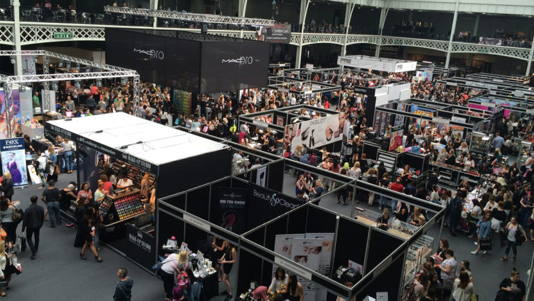
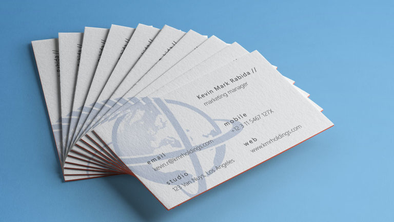
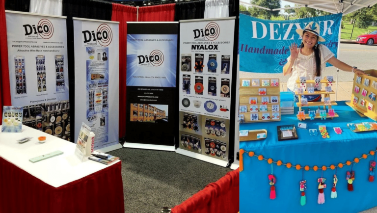
PrintPlace.com Blog


Classy Texture Ideas for Corporate Business Cards by PrintPlace.com
October 26, 2011, 4:52 pm
Filed under: Design Inspiration | Tags: ,

You have to be careful with corporate business cards. The key is to keep it classy without being too plain-jane, and one way to do this is by avoiding over-the-top designs. Fortunately, this doesn’t mean you have to stick with a simple black and white design, even though black and white does work for some designs.

One simple way to add a subtle touch of interest to your cards is with a classy texture. While you can use just about anything for a texture, from photos of natural elements to illustrations, remember that you are striving for simplicity with corporate business cards. Three styles of textures typically work well: noise, gradient, and stylized textures. All three can be created on your own or downloaded for free or a small fee online. Check out the ideas in more detail below, and follow the links for some great ideas and downloadable textures.

Noise Textures

Noise looks like a grainy texture. Use it to make your corporate business cards look like they are printed on heavier paper or just give the solid background color a pop. Noise textures are easy to create. You can even use online Noise Texture Generators or make your own.

Gradient Textures

A simple way to give your card an updated look is with a gradient. These simple design elements smoothly blend between two or more colors. You can use gradients to give your card a glass-like look, create a multi-color blend, or just blend between two similar colors for a lighter touch. As always with corporate business cards, think subtle. You can download lots of gradient patterns, make your own online, or use a graphics editor program to make them.

Stylized Textures

For the less subtle but still classy range of textures for corporate business cards, you can use stylized textures. These range from wood grains to brushed metal and many, many more. You can download stylized patterns for backgrounds, use online tools, or use a graphics editor to create your own from scratch.

No matter which style of texture you decide to use for your business cards, keep in mind that less is more, especially when it comes to a professional look. And remember, a great way to make textures stand out is with a unique business card printing option such as letterpress or embossing.


15 Inspiring Black and White Business Cards by PrintPlace.com
June 30, 2011, 4:50 am
Filed under: Print Place General | Tags: ,

You may have been looking to colors for inspiration too much. With the two tones being the extreme contrast of the other, black and white business cards dominate the pack when it comes to clean, striking and professional designs. Mixed with a clever logo or a drop of design humor, here are some practical and inspirational ideas for a black and white business card.

DISCLAIMER: The following images are not owned by PrintPlace.com and are used for the sole purpose of inspiring our viewers.

Muku Studios

Killemil

Print Pinball

Index Estudio

(more…)


8 Ways to Enhance Your Corporate Identity by PrintPlace.com

Does your company have all the materials needed for a successful brand image?

Though advertising and other marketing materials reinforce your company’s image, common business tools such as business cards, letterheads, envelopes, notepads and labels complete the brand identity package.

Let PrintPlace.com give your company’s image a lasting professional touch. Get all of your business essential products printed today!

Letterpress Letterhead & Envelope: ABC

Letterhead is the foundation of corporate identity. Complete your corporate image and add a matching full color envelope.

Albuquerque The Magazine Letterhead PKG

Stationery printing is foremost the top professional method of choice when tying your brand in with all marketing and advertising materials.

Osuna Nursery Letterhead

To really round out your image, print custom envelopes along with your stationery. Custom envelope printing that includes your logo and corporate identity is proven to dramatically improve read rate of direct mail.

Business Cards for The National Museum of Nuclear Science & History

Business cards are the most portable and informative form of communication that is always on hand.

Bone Bistro Letterhead package

Adding a notepad to an already complete stationery set is a great way to keep your company information in front of your customers.

OilSlick Letterhead Package

Give your brand image an extra touch of professionalism with hang tags. Take your product image up a notch while reinforcing your brand.

My New Business Cards

While a customer may not be able to keep your presentation materials on hand, your business card is a different story - they can grab it and go.


Five Important Considerations for Business Card Printing by PrintPlace.com
October 2, 2009, 7:50 pm
Filed under: Print Place General | Tags: , ,

Before rushing into the all-important task of business card printing, take a moment to think about the role of your contact card. A business card should say something about you and your company. It should bring recall to the conversation between you and the client long after you have parted. Therefore, designing a business card should be carefully completed. Here are five considerations to keep in mind for creating a memorable business card.

Businesscard

  • Stand out in a crowdAt any business event where everyone is passing out their business cards, attendees usually come away at the end of the day with a handful of contact cards. Yours should accurately and uniquely represent your company. Don’t make the mistake of creating a design that gets lost in the crowd, but rather one that stands out.
  • Subliminal messagesThe meanings of colors is a powerful way to convey certain feelings. Taking the time to research the different messages that each color sends will result in more than just a colorful card, it will also send the right kind of message.
  • Tactile advantagesOne important aspect to business card printing that many people forget about is the feel of the card. When touching your card, a client will associate any unusual tactile sensation with your personality. Try velvet for a more gentle message or sharp edges for an “all-business” corporate association.
  • Quality stockUsing cheap paper tells others that what you have to offer is cheap. Prospects will have trouble believing that your product has the best features of any available if your contact information is printed on flimsy, low-quality stock.
  • Speak clearlyThe typography you choose for your text needs to not only represent your business image but should also be easy to read. Business cards do not allow for large a font, which means that the type of font you use should be easily readable in a small size. Too many curlicues will hide the shape of the letters, so opt for something a little more easy to see.

Always consider these five aspects of design before printing business cards to insure that yours accurately and uniquely represents your company image.


Why Isn’t Your Brand “Sticky?” by PrintPlace.com
September 25, 2009, 7:14 pm
Filed under: Print Place General | Tags: , , , , ,

Whether you are a new company looking for ways to make sure your brand is successful or a company that has tried and tried again but just can’t seem to get your brand to stick, there is a solution. When a brand flops, it is usually due to the same few mistakes. Your business can create a successful brand simply by knowing the most common reasons for branding failure and know how to correct them.

sticky marketing

No Memorable ImageSome companies make the mistake of creating a logo without a memorable image.  Make sure that the image in your logo is something that is uniquely yours and is appropriate for your company. Think of the Nike logo – the swoosh image  is not only one-of-a-kind but also appealing to their target audience. The swoosh looks athletic.

Inconsistency - In every single item that is associated with your company, whether color posters or packaging materials, consistently use the same core branding aspects. The same logo, company name, tagline will reinforce your brand over and over to the public. For the same reason, you will need to give employees the same business card design for further branding consistency.

No FocusWhat do you do best? What do you want to be known for? Whether it is one-on-one personalized service or the newest technology, constantly reinforce this unique offer. Also, know who your company appeals to. Know your target market so that you don’t waste your branding efforts on an audience that doesn’t have a need for your services. Knowing your target audience will further help you fine tune your company image to fit your customers’ needs and lifestyle.

Unbelievable MessageYour tagline and core message should be believable to customers. If you advertise like Verizon Wireless that “we never stop working for you,” you’d better follow through and never stop working for a customer when they come to you with a complaint about your service or product.

Poorly Constructed MessageIn order for your customers to both remember and believe your message and tagline, they need to be able to understand what it is you are offering. If your message is jumbled with too many technical terms, your customers will get frustrated and give up trying to understand you. Be clear with your words and phrases so that customers know exactly what you offer and also what sets you apart from your competitors.

Poor MaintenanceEver heard the phrase “keep on keeping on?” Don’t just stop with one marketing campaign, one run of color posters, one printing of brochures. Your marketing campaigns should be ongoing and constantly putting your brand in front of your target market. This concept is at the heart of successful branding. Most brands are successful simply because they become recognizable because they are always in the public eye.

Poor Customer ServiceTrain employees on your mission and goals. If your employees don’t know the image your company wants to portray, how can you expect them to portray this image to your customers? Employees should know the reason for your tagline; they need to be excited about making your brand known to customers.

Old Marketing MaterialsKeep your look fresh by re-designing your marketing materials, including flyers, brochures and postcards every so often. While it does save money to order larger quantities, don’t order too much or you’ll bore your target audience with the same materials year after year. Just remember to keep your key branding items the same.

No Word of Mouth AdvertisingOne of the most common reasons for customers to switch companies is through referrals from their friends and family. Give existing customers referral postcards with a 10% discount for new customers, and give your existing customers the same for every postcard with their name on it that gets used. When you get positive feedback from customers, ask if you can use it in your brochures or place it on your website. Referrals help to reinforce the integrity of your brand.

No Plan for TestingYour business needs to keep track of marketing efforts so that you know what works for getting your brand name to your target market. Track the return on investment (ROI) of your direct mail campaigns, research the best locations to hang your color posters, ask new customers how they heard of your business. Testing your marketing efforts will help you to build a tried and true campaign that will work for you year after year.


Follow

Get every new post delivered to your Inbox.