Graphic Design Friday: 5 fonts you should never use
Today’s video is from our own graphic designer, Chambley. She talks about five fonts you should never use in marketing and why. She also has font recommendations to substitute for maximum impact.
Watch our video or read the transcript that follows.This is the first in our series of Friday graphic design tips. Every Friday, we will have a new video for you with tips, techniques, and interesting information to keep in mind whether you are creating flyers, rack cards, or any printed products.
Video Transcription
Hi, I’m Chambley, and I’m a graphic designer here at PrintPlace.com and today I’m here to talk to you about five fonts you should never use.
First up on the list is Comic Sans. The font isn’t really that bad when used appropriately, and by appropriately I mean only for children’s birthday party invitations and the horrible office-printed “do not enter” signs, but should never be used for corporate products, or any mail that you plan on sending to customers.
Comic Sans gives the reader a “please don’t take me seriously” vibe. You can replace it with a visually more relaxing font, a font that has a bit of informal meets formal. Try replacing your Comic Sans with Lexia Readable.
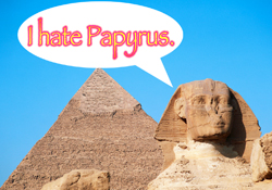
Next up is Papyrus, the MegaMan of bad fonts. Avoid this font if you want to be taken seriously. It has no place is ANY of your business/corporate print products. The odd “rough” texture gives the font an irritating view for the reader’s eye. This font has been overly used for everything from business logos to church pamphlets. You can replace with a font that has similar qualities, without the annoying, rough texture. Try Florentine. It’s a beautiful font that still has some of the characteristics that you like about Papyrus.
Third, we have Brush Script. The most used script font, especially for anything baseball or sports related. It’s supposed to simulate a person’s handwriting with an ink brush, but really it’s graceless and doesn’t visually flow very well for any reader’s eye. Try replacing it with a font that has more of an actual hand written quality or with better visual movement. Go ahead and try out Southern Aire.
Number four on the list is Impact. It’s too thin, too focused and too amateurish to stand out. It’s overly used as a headline font. Go for a wider, more readable font. You can try Bebas Neue. It looks really great, isn’t too thin, and still is bold enough to use as a headline font.
Last but not least, a font everyone is familiar with, Times New Roman. It’s the “boring information” font. Because it was a default font on the Microsoft Word program up until 2007, it’s highly over used for body copy text. Because readers are so used to seeing this font in high-volume information areas, ie. the newspaper, their eye tends to overlook or ignore any information that you set in this font. There are so many other fantastic fonts you could use for large bodies of text, or even bold headlines. Try replacing it with a similar serif font that has a more elegant, less dated look. I like to replace mine with Sanford.
To download my suggested fonts, follow the links in the description below. Don’t forget to subscribe and stay tuned next Friday for more tips from PrintPlace.com.
What font do you think is the worst? Let us know in the comments below.
PrintPlace’s mission is to provide customers with unparalleled printing services through the knowledge and expertise of its employees.
1 thought on “Graphic Design Friday: 5 fonts you should never use”